A new era for RWB
The Royal Winnipeg Ballet (RWB) is the longest-running ballet company in North America. With new leadership and a fresh artistic vision, we are entering a new chapter and needed a brand that could reflect that evolution.
The Royal Winnipeg Ballet (RWB) is the longest-running ballet company in North America. With new leadership and a fresh artistic vision, we are entering a new chapter and needed a brand that could reflect that evolution.
Following a thorough Request for Proposals process and conversations with a range of leading creative firms, we selected Bruce Mau Design (BMD) as our creative partner. We brought BMD in to translate Artistic Director Christopher Stowell’s artistic vision and Executive Director Elena Tupyseva’s leadership into a new brand strategy, identity and digital experience, one that could reconnect us with existing audiences while opening the door to new ones.
With a global portfolio of transformative brand projects, including the recent rebrand of the National Ballet of Canada, BMD brought deep experience in helping leading arts organizations articulate their purpose, strengthen their identity and connect with audiences in new ways.
Why a New Brand Now
This is an exciting moment for the Royal Winnipeg Ballet. Our previous identity served us well for 20 years, but with new artistic and executive leadership and strong organizational momentum, we felt it was the right time for our visual identity to evolve alongside the organization. This new brand gives us a stronger, more contemporary way to tell the next chapter of our story while continuing to honour the history and legacy that have shaped us.
The Process
BMD began with an extensive research and discovery phase, visiting the RWB and engaging with our archives, audiences, students and families, Board members, donors, staff and Indigenous community members to understand how our stakeholders see the organization and its future.
For BMD, understanding the RWB meant understanding the context and character that have shaped us. Our Prairie roots, unique beginnings, Royal history, artistic ambition and deep connection to our community all informed the development of our new brand platform and visual expression.
Winnipeg as a Key Inspiration
Winnipeg is at the heart of who we are, and that sense of place became a central inspiration for the new identity.
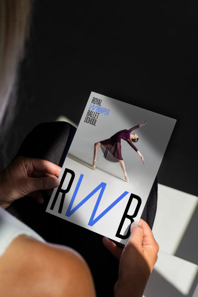
The W stretches into a distinctive position, signalling both the strong connection we have to this city and our instinct to challenge conventions. In the long-form mark, colour brings the W and “Winnipeg” to life, giving the city the presence it deserves.
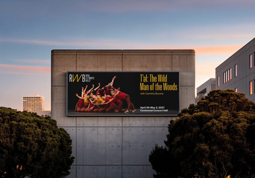
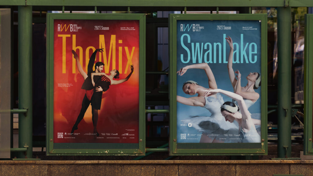
“One of the things I’m particularly excited about is the flexibility we have to bring colour into the brand by selecting key colours from the imagery we use for each performance or initiative. This allows the logo to feel more dynamic and distinctive across different applications. The new brand also introduces a strong typographic treatment that we can use in bold and striking ways, including with our production titles.” –Amy Rebecca Harrison, Director of Marketing and Communications
The gesture of the expanded W extends beyond the logo and into the secondary typeface. A variable font brings the same sense of movement and energy into everyday communications, creating a visual language that can shift, stretch and respond.
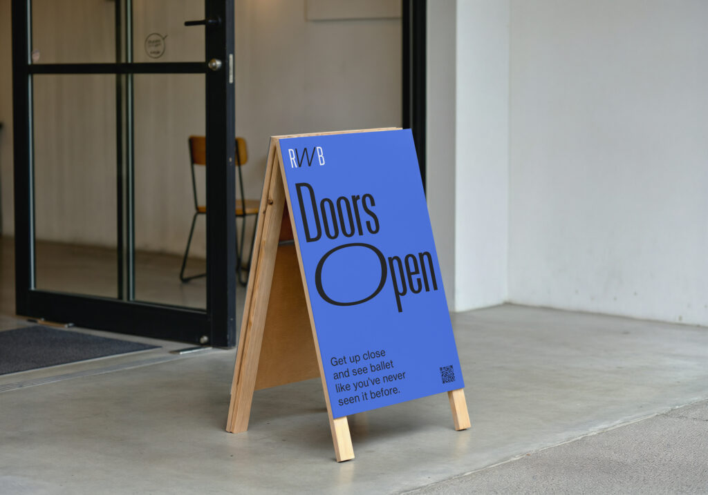
The core colour palette creates a clear visual distinction between the Company and the School. Black draws from the performance environment, while white reflects the brightness of the School’s studios.
In marketing communications, the palette comes alive through photography and the distinctive visual worlds of each production.
“Bruce Mau Design took the time to deeply understand who we are — our history, our art form and, most importantly, where we want to go. Their process helped us look closely at what has always made Royal Winnipeg Ballet distinctive: our adventurous spirit, our willingness to take risks and our commitment to pushing the art form forward. I’m excited by a brand that honours that spirit while giving it a new expression — one that feels bold, expressive and alive, and creates space for us to connect with new audiences while building on the remarkable legacy that brought us here.” — Christopher Stowell, Artistic Director
Bringing the Brand to Life Digitally
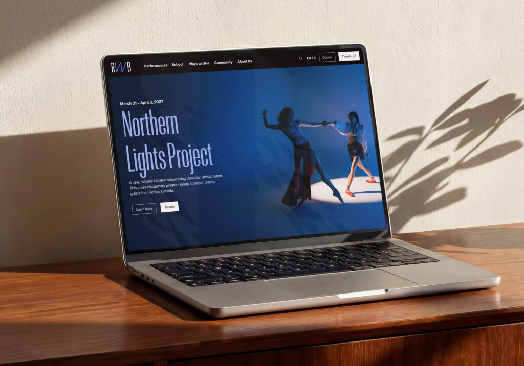
BMD partnered with digital agency Plank to create a dynamic digital hub for both the Company and the School, with clear pathways between the two.
Edge-to-edge photography, new motion behaviours and video moments create a more immersive experience, bringing audiences closer to the energy of the RWB and making it easier to discover everything we have to offer.
“BMD was a true partner throughout the process. They brought a clear, thoughtful approach to a complex organization with a long history and many stakeholders. They listened closely to different perspectives and helped us find the common thread that could move the brand forward into the new era ahead of us. They engaged with us throughout the process, creating a genuinely collaborative experience, and delivered a brand that gives us new ways to tell the many stories of Royal Winnipeg Ballet.” — Amy Rebecca Harrison, Director of Marketing and Communications